-
-
-
-
URL copied!
Gone are the days when designers used flashy illustration, animation, and ornamental elements to wow the user. Even though skeumorphism (i.e., creating 3D effects on a 2D surface) was very popular just a few years ago, designers now risk dating their websites or apps by using it.
Up until 2012, skeumorphism was the leading trend in digital design. Based on the Greek words “skeuos” (i.e., container or tool) and “morph” (i.e., shape), skeumorphism design took its cues from the physical world. Its primary focus was to make icons and other UI elements look “real.” Designers had to keep light and shadow in mind to prevent objects from looking fake.
Skeumorphism was one of Apple’s key design principles. Steve Jobs was able to successfully bridge the gap between new technology and non-techie users by providing elements that looked familiar, such as a 3D address book icon on the iPhone to represent a user’s Contacts list. This contextual approach enabled users of all levels to comfortably transition from the real world to the digital world.
However, digital interfaces are common now. Users don’t need UI elements to look like real world objects to understand them. Goodbye to complicated designs that are dominated by brushes, gradient drop shadow, strokes, light effects, etc. Now designers are creating UI elements with simple flat shapes and icons.
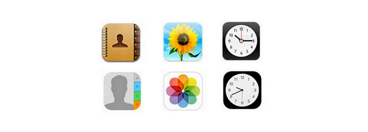
Microsoft and Apple have made this design popular during the last few years. Microsoft used flat design in Windows 8, and Apple also ditched skeuomorphism in iOS7. Below you can see a side-by-side comparison of Apple’s iOS6 icons (skeumorphism) and iOS7 ions (flat design). The Contacts and Photos icons have become more symbolic, and the Clock has been stripped of its lighting gradient.

Below are the five principles of flat design and notes on how to achieve these goals:
-
Remove depth: Remove 3D elements from the UI, drop the depth, and remove all shadows, gradients, and strokes.
-
Use simple elements: “Flatten” icons and other elements by using simple shapes; ornamental elements are unnecessary clutter.
-
Focus on color: Use slightly desaturated colors to add beauty to a page instead of bleeding a user’s eyes with too much brightness.
-
Focus on typography: Use crisp and clear fonts that are chromatically placed with colors and shapes.
-
Embrace minimalism: Eliminate unnecessary elements and leave lots of empty space.
About the Author
Gopal Juneja is a senior engineer at GlobalLogic with over 13 years of experience in the technology field. He specializes in designing and developing UIs and is passionate about design.
Trending Insights
If You Build Products, You Should Be Using...
Digital TransformationTesting and QAManufacturing and IndustrialEmpowering Teams with Agile Product-Oriented Delivery, Step By...
AgileProject ManagementAutomotiveCommunicationsConsumer and RetailMedia
Let’s Work Together
Related Content
Leveraging SaMD Applications to Improve Patient Care and Reduce Costs
One of the most exciting developments in healthcare is the emergence of Software as a Medical Device (SaMD) as a more convenient and cost-effective means to deliver superior care to the tens of millions of people worldwide who suffer from various health conditions.
Learn More
If You Build Products, You Should Be Using Digital Twins
Digital twin technology is one of the fastest growing concepts of Industry 4.0. In the simplest terms, a digital twin is a virtual replica of a real-world object that is run in a simulation environment to test its performance and efficacy
Learn More
Share this page:
-
-
-
-
URL copied!